So your music is ready. The recording is done, the mix is finished, and maybe you’ve even mastered the audio. It’s all good to go, except for one thing: the cover.
The artwork you use for your single or album is one of the first points of contact that you have with your listeners, so it’s important to make a compelling first impression. After all, in this digital age, your cover art won’t just live on Apple Music or Spotify, but also in social media posts, YouTube thumbnails, and ads for your music! All these brand touchpoints will work in turn to paint your audience’s view of your work, making it important to have a cover that jibes well with what you’re putting out there.
So rather than just busting open Microsoft Paint and laying down some text on a square and calling it good, here are some tips to consider when designing your album cover.
Three Basic Elements of Album Covers
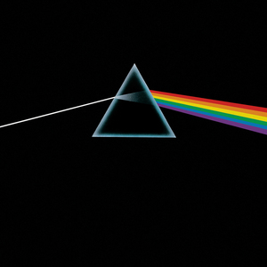
Every album cover has some kind of subject that is the focus. Sometimes it’s the artist or band, other times it’s just their name, and occasionally it’s neither (looking at you, The Dark Side of the Moon). Let’s take a look at a couple of examples.
A quick word of warning: the following covers are intended to be examples. As righteous as they may be from a design perspective, a few of these references actually wouldn’t meet CD Baby’s current DSP guidelines for cover artwork. For full details about what your art can and can’t include, go here.
Photos
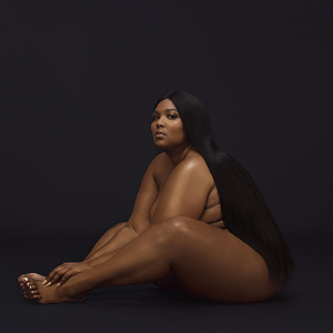
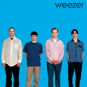
Photographic covers work great for artists and bands getting their names out there, as well as established acts that are trying to hit a certain aesthetic. Photos can also establish an emotional connection with the audience, showing that “Hey, there are real people behind this music!”
Very often a good band photo on a simple background will do the trick just fine.

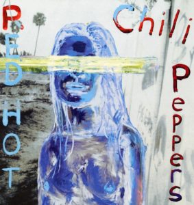
Illustrations/Graphics
When you can’t say it with a photo, sometimes you have to draw a picture. Lots of covers feature illustrations or graphics in a wide array of styles, from hand-drawn doodles on notebook paper to reproductions of paintings and all aspects in-between.
What jibes best with the themes and ideas your album is putting out, and how can you say it graphically?
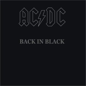

Typography
This is a ten-dollar word, but typography is basically the arrangement of letters or words in a legible, readable, or otherwise aesthetically-pleasing way. In this age of metadata and digital information technology, it’s possible to make a cover that uses no text at all, but if you do use text, it’s good to keep the aesthetics and function in mind.
Many album covers use type subtly, picking a font that pairs well with the central imagery for the band name or album title, but there are a few out there that use type as the sole subject of the cover.

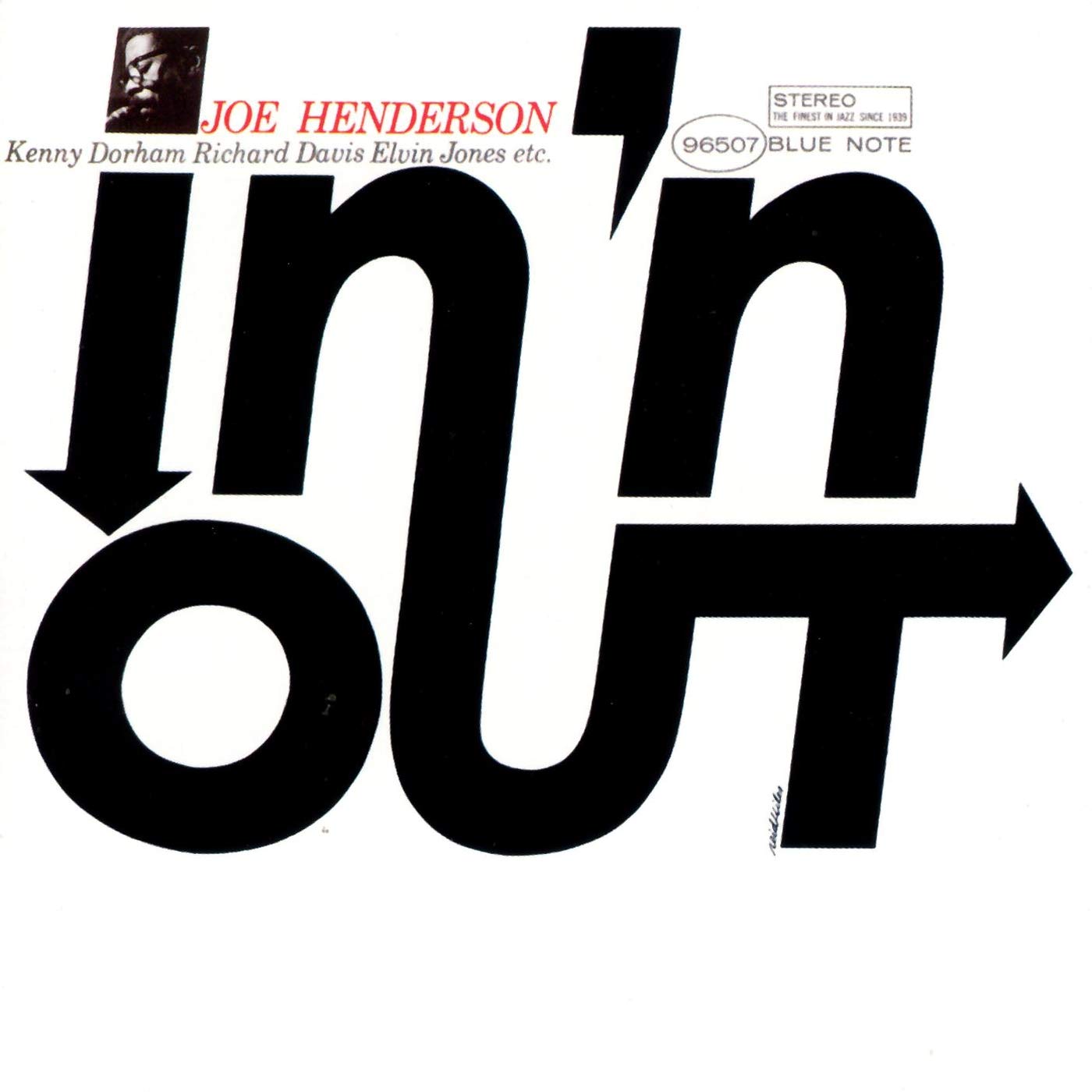
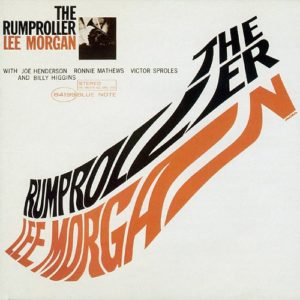
Keep in mind that you’re not limited to just one of these options here. Many successful album covers use any combination of the types of subjects above, but the best covers maintain a sense of balance or harmony between them.


Finding The Right Album Cover Concept
So how can we ensure that we’re maintaining a good balance of subject matter in our album covers?
The first thing we can do, rather than jumping right into the digital canvas and plugging away at the cover, is take some time to come up with a few different ideas in the analog world. That’s right, it’s time to get sketchy. This brainstorming step is key to developing a strong concept.
Here are a few suggestions to help you find the best cover artwork concept:
1.) Pen and paper are your friends!
At this stage, there’s no need for special fonts, colors or images – just simple, gestural ideas. Sketch away.
2.) Focus on quantity over quality!
It doesn’t matter if you’re a professional artist or a stick-figure doodler, this stage isn’t about details, but rather having a deep well of ideas to sift through. Try shooting for 15 to 20 different concepts.
3.) Keep your sketches small!
Remember, this stage isn’t about your FINAL cover design or image file (which should be a minimum of 1400×1400 pixels, btw — while 3000×3000 pixels is ideal). This phase is about brainstorming. When you keep your initial concept sketches small, not only will you get a better sense of scale for your Spotify or Apple Music thumbnails, but there’s less need for detail at a smaller size, which will help you develop different concepts faster. Once you’ve settled on the best approach, THEN it’s time to dig into the actual design, which should yield an image that looks great as a tiny thumbnail AND in large displays such as smart TVs.
If you’re having trouble coming up with ideas, don’t hesitate to grab some reference images from the internet. Find what inspires you and use it as a springboard for new layouts and concepts! Don’t copy your references bit-for-bit, but really inspect them and decide what works well, what doesn’t, and how you can apply it to fit your needs.
Once you’ve gotten a bunch of ideas out, it’s just a matter of sifting through them and picking the right one. You may have felt it early in the process, or you might have no clue which of your layouts is right for you. To start, try trimming off the clichés and otherwise silly ideas that turn you off, or don’t speak to your brand of music. Consult with others, especially people who may have an artistic eye that you respect and expect to have an unbiased opinion. In any case, take some time and filter out the bad ideas from the good, and pick your best sketch to build off of.
Then be sure that no element of your concept violates the cover artwork guidelines of the big streaming platforms…
Going Digital: Software to Design Your Album Cover
When you’ve hit that mark and found the right layout for your album, now you’re ready to refine your concepts. This can be the moment to take your work into one of any number of digital tools.
Since this isn’t a tutorial, I’m going to skip the specifics, but I will give you my top two recommendations for digital programs:
1.) Adobe Photoshop
Photoshop is the industry standard for photo editing and manipulation as well as digital art in general. It’s simple enough to get started, set up your image size, and go to town placing and laying out your imagery – provided you know what tools you’re looking for in the software. In that regard, while Adobe provides general Photoshop walkthroughs, Google and YouTube are great resources for finding design tutorials for your cover.
One caveat, however – Photoshop ain’t cheap. You can opt to buy a subscription to Photoshop for about $21/month, as they don’t sell the program outright anymore, or you can try to wrangle a student account to get Adobe’s entire suite of programs (including Illustrator, InDesign, and more) for about $20/month. Either way, budget accordingly.
2.) Canva
If you and your mates are having trouble getting the cash together for Photoshop, Canva is a solid free alternative. Canva has a bevy of templates, free fonts and artwork that you can utilize in your cover design. Keep your eyes peeled for premium stock photos and illustrations in some of those templates, though, as Canva will charge for use. You can sign up for a trial of their premium features, but again – be smart with your money (and your timing).
If Canva sounds like a good fit for you, check out this video by Chris Robley walking you through the Canva workflow in a quick overview:
Working in these programs, as simple as they claim to be, can be an anxiety-inducing endeavor for some. There are so many different tools and techniques that an artist can utilize in this software that it can get a little overwhelming. Plus, it takes a bit more than just a pretty font and a picture to make an album cover that will make an impact.
So how can we leverage these digital tools to get the best final product? I’ve got four words for you…
“Keep it Simple, Stupid”
You might have heard that phrase before, or it’s less-incendiary acronym K.I.S.S. It’s not meant to be disparaging or negative, just a firm reminder that complexity can breed confusion, which can turn off any individual from a design. Let’s go over a few ways you can keep your digital designs simple:
Limit your colors
You don’t need the whole crayon box on your page when two or three colors will do the job just fine.
Use only one or two typefaces for text
Otherwise your cover will look like a ransom letter. But if that’s what you’re going for, more power to you. Don’t let me judge your life.
Don’t crowd your cover!
Give everything a little room to breathe. The added space around your subject or your text will not only look better, but it will lead the viewer’s eye to the most important parts of your cover. (We in the design biz call this white space or negative space!)
I know, I know — this is a lot to remember and hold on to. Making a cover is easy, but making a good cover? Yeah, that’s hard. Fortunately, I have one last piece of advice to simplify the whole thing, if all else fails.
Hire a Graphic Designer
Look, you’re busy making beautiful lyrics and music, so you shouldn’t have to spend your time learning a new skill. A lot of folks have no choice in the matter, of course; they don’t have the money or the network to reach out to a professional.
However, if you do have the resources, I’d recommend taking that added pressure off your shoulders and hiring a designer. Most graphic designers have the training and experience necessary to make these decisions so that you don’t have to! Keep in mind you should:
Find a designer that is a good fit for your needs
It’s important to do your due diligence when searching for a graphic designer. Some designers have specialties (typography, illustration, collage, etc.), while others have a more general practice. Always look at an artist’s work before hiring them on.
You can do this by browsing professional portfolios on websites like Behance or Dribbble. Or do a light Google search for designers in your area and sending out a cold e-mail. More economical services like 99Designs or Fiverr also work, but I guarantee that you’ll have to sift through a lot of crap to find the gold.
Communicate
Like any collaboration, communication is key when working with a graphic designer. Determine the best medium for communication (e-mail, Zoom, in-person, etc.), and perhaps work together to schedule some progress check-ins. If you have ideas in mind, feel free to share them, but leave some space for them to work in. Keep those lines of communication open, at any rate, and you both should have a much easier time.
Set aside a budget!
Good designers are artists, like you, and deserve to be paid for their art. Too many times have I heard “but you’ll get exposure!” The fact is that exposure doesn’t pay the bills.
How much is enough? Well, that’s where we go back to communication. Have a conversation with your designer about their rates, and what they think would be fair. It’s all about finding the common ground.
“Wrap it up, Dan…”
Making an album cover that will leave a lasting impact on your fans and potential listeners is no simple feat. It takes a bit of research, brainstorming, and trial-and-error. Hopefully, though, with these tips in mind, you can chart a course through these waters and land on something that really resonates with you and your base.
But tell me, did I miss anything? How do you design your covers? Sound off in the comments and let us know!
