
Why making acceptable cover art is so important.
In the streaming era, you need cover art for every single and album you release. Not only should that artwork LOOK good; it also has to meet the visual guidelines of the big streaming platforms if you want your music to stay available online.
Does cover art still matter in a streaming world?
Back before streaming and even downloads, when record stores ruled the music world, an album cover was often all a shopper had to go on when they were browsing the shelves.
How many unsuspecting teens in the ‘80s stumbled onto Iron Maiden in a store and bought The Number of the Beast or Piece of Mind sight unseen and sound unheard due solely to Eddie’s grisly mug staring back at them?
Take a look at these covers and tell me you wouldn’t be horrified/intrigued if you came across them among the racks without knowing who the artist was:
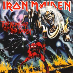
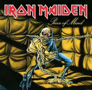
But it’s not just Maiden — or even heavy metal — that makes iconic cover art a priority. Throughout the history of popular music, musicians have chosen to adorn their albums with immediately recognizable covers. One glance at the Schizoid Man on the cover of King Crimson’s landmark prog debut In the Court of the Crimson King and you know you’re in for a wild ride into the experimental side of rock.

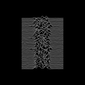
Similarly, Joy Division’s choice of a simple data plot visualization of radio pulsar signals centered against a black background was a perfect representation for the stark, cold post-punk sound on Unknown Pleasures.
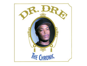
And we can’t forget the endlessly imitated cover of Dr. Dre’s The Chronic, featuring a portrait of Dre framed in a design similar to the Zig-Zag rolling papers he used to wrap his album’s namesake.
For all these classic albums and hundreds more, the cover art is a window into the music therein. Thing is, it’s still that way today.
Even in the age of endless listening for all, the cover you choose for your single or album plays an essential role in representing your music before someone even clicks “play.” Heck, having professional-looking cover art might be even more important now than it was in the physical media days of yore.
Modern listeners are given more options for music consumption than ever before. If you’re scrolling through Spotify looking for new tunes, are you going to click on an artist who couldn’t be bothered to represent their work with something at least professional, if not eye-catching? Or are you going to queue a song whose art looks like an MS Paint experiment gone wrong?
And for your own music: you put all the hard work into creating it. Why not wrap it in a pretty package?
But don’t just take our word for it. The digital platforms (Spotify, Apple Music, etc.) demand artwork that is at the very least legible and consistent with their guidelines. The guidelines listed below are in place to encourage a good user experience, and to avoid misleading or confusing info on cover artwork.
But how do I make good cover art without spending a bunch of money?
Later in this article we’ll show you a super easy (and cheap!) way to design your own art, but before you start on that we’ll explain the digital platforms’ artwork guidelines, so you know exactly what to include and what to avoid.
Keep in mind, these rules aren’t about limiting your creativity. They’re in place to protect all parties involved (you, your distributor, your listeners, and the music platforms). It’s about creating a good experience for fans, avoiding things that could be confusing, incorrect, or offensive, and making sure your cover art is an invitation to your music, not a warning sign that listeners should turn around and listen to someone else.
Yes, even in the ever-changing realm of digital music, there are rules to follow if you want your music available where people can access it. How does CD Baby know these rules? Because we’ve been successfully distributing music to dozens of platforms for over 15 years, and those platforms send us their submission guidelines. Artwork is the most common hangup for artists when submitting their music. Our knowledge of these rules ensures your music goes live and stays live. It’s just one of the many reasons to distribute music with us.
Here are the most commonly asked questions about cover art:
Q: Do the covers for each of my releases need to be unique?
A: Yes. Every single release should have a unique cover, so as someone scrolls through your discography they can identify each release by the cover alone.
Q: Does the text on my art need to match the metadata exactly?
A: Yes. The text on your cover art needs to exactly match the info you entered for your release (artist name, title of the album or single, etc.). If you entered “Blueprints” as the album name, it can’t say “The Blueprint” on the cover art.
Q: Are abbreviations allowed?
A: Sort of. Full abbreviations are okay, but not partial abbreviations (for instance, “ATM” is fine, but not “AT Machine”).
Q: Can I put my record label on the artwork?
A: No. While this is popular in underground hip-hop and EDM scenes, the major platforms do not permit the label being on the cover art.
Q: Do I need to put a Parental Advisory warning on my artwork if my music is explicit?
A: Parental Advisory warnings are not required, since there is an “explicit content” tag on the platforms. But if you include a Parental Advisory warning in your cover art, there must be at least one track with explicit lyrics.
Q: Does even my featured artist information need to match?
A: Yep, that needs to match too. If you have a featured artist listed in the text on your cover art, that featured artist must be included in the metadata for the release.
Q: Can I use copyrighted imagery?
A: Absolutely not. Some sectors of the Internet may be the Wild West, but copyright infringement is never okay. Don’t use characters, logos, or products that belong to other people, companies, or institutions. Just put a piece of tape on that Red Bull can so we can’t see the logo. And we’re sorry, but this also includes the Wu-Tang logo.
Q: Can I put the name of the artist I’m covering on the art for my cover single?
A: No. The name of the artist you’re covering is not allowed on the artwork for your release. Otherwise it looks like it’s them performing and not you.
Q: Can I use a watermarked image?
A: No. If you use a stock image, PAY to download the image without the watermark. And no, calling your album “Getty Images” doesn’t make it okay.
Other artwork minutiae:
- Don’t use the phrase “The Original” if you’re referring to a cover song (because duh).
- Avoid stretching your image to a different aspect ratio. That leads to blurriness (not the artistic kind), pixelation, awkward borders, or some other form of aesthetic assault.
- Avoid upscaling your image to a larger size. You’ll likely be committing the same crimes as above. For instance, taking an Instagram photo with a filter and then blowing it up to 3000×3000: yeah, that’s gonna look like crap.
Do NOT include the following:
- Contact info
- Advertising messages (“Buy my new single!”)
- References to contextual time (“Brand new!” “Just released!”)
- UPC barcodes (those go on the back cover of a physical product)
- References to product format (CD, vinyl, digital single, rpm, etc.)
- Availability (“Available on Spotify, Apple Music, etc.”)
- Nazi logos or other hateful crap (there are laws in some territories – and also it’s gross)
- Gruesome images of graphic violence, or images that refer to violent content in the music (Cannibal Corpse is cool and all, but their older gory art is only there because it’s grandfathered in)
- Pornography (we know it when we see it – so does Apple)
- Pictures of a clear CD jewel case or any other physical media. (First, it’s been done already. Second, it’s not allowed)
- A blank white or blank black square image with no text
- Avoid excessive or irrelevant text/information
- Text messages
- Images that include a bunch of text
- “Yeah but Kanye…” – Nope
Here’s a few things that ARE allowed, though we still get asked about it a lot by artists:
- Casing rules don’t apply to cover art, so you can have all caps or lowercase or whatever mix of the two you want
- You can use the same image for every single, as long as the text differs on the cover for each one
- You can have an image with NO text, but you can’t reuse that image (without text) for another release
- It’s okay to use the name of the artist you are covering, if:
- It’s a tribute release (and not just a one-off cover song)
- Your artist name appears larger than the artist you’re covering
- You must have “Tribute to” larger than the original artist name
- Karaoke tracks must include “Originally performed by” on the cover art
- Karaoke tracks must be designated as such in the “karaoke” genre
- Fan art — as long as it’s clearly distinguishable from the original (It’s okay to use your own drawing of Totoro on your cover of the Totoro song, but not if it’s SO GOOD it looks like the original)
- Public Domain images — but be prepared to provide proof that what you’re using is in the Public Domain
- Stock art — as long as you’ve read the usage guidelines and are following those rules
- Your social media handle — as long as you don’t mention WHICH social media platform
Here are the guidelines for the art file itself when you’re on the CD Baby Art Uploader page:
- A square image
- Preferably 3000×3000 (so it will look good when scaled down). It’s always better to have art that is too large than too small. Remember that you can scale down a large image without distorting it, but scaling up a small image will make it look blurry and pixelated
- A .jpg or .png file (and putting “.jpg” at the end of a .pdf filename, while creative wishful thinking, doesn’t work to convert the image file)
- The color calibrated to RGB — if in Photoshop; no CMYK or uncalibrated image files (Tip: open a .png in Paint and save as a .jpg and it will automatically convert to RGB)
Okay, that’s a lot to think about, and if you’re a new artist looking to dress your first release with some proper visuals — or if you’re an experienced artist just looking for some quick artwork on the cheap — we’ve got a few tips for you. If you don’t want to go through the rigmarole of hiring am expensive designer with Photoshop expertise or learn the complex design techniques yourself, you can actually create simple but effective cover artwork yourself in very little time and little to no money.
Here are two ways to get an album cover setup for free (or less than $5):
Option 1: Using a Canva Album Cover template
Canva is a freemium tool that helps you design just about anything. They have a whole section of professional-looking album cover templates for you to get started. It’s quick and fun to use their tool, too! And it’s a heck of a lot cheaper than buying Photoshop, or paying someone who has it to design your cover art. We encourage you to get into Canva and play around.
Here’s a walkthrough of how to build an album cover using Canva:
- Go to Canva’s album cover section here.
- Click on “Start Designing Your Cover”.
- You’ll have to create an account. It’s free.
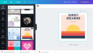
- On the left-hand side, you can select any of the templates. When you hover over the template, it will show if it’s free. If it’s not free, it’ll usually cost $1. In this graphic below, we’ve chosen a free template.
- Canva’s templates default to 1400×1400. While this is acceptable for the platforms, we recommend using an image that’s 3000×3000, since that will scale better for future use. If you begin with an album cover template, you CAN use the “Resize” tool to make your design 3000×3000, but that is a feature only available to Canva Pro members (ummm, can you say “free trial,” anyone?)
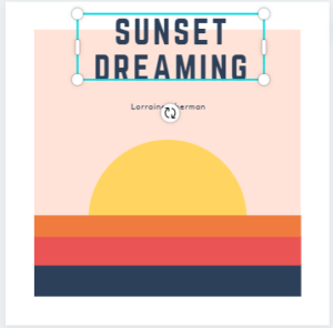
6. Now that we’ve settled on the template, let’s update the text for our album. Let’s say we’re releasing a single called “Boogie Sunset” and the artist’s name is Good Cheese.
We can click on the text in the graphic and type in what we want:
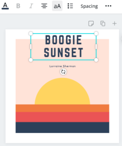
At the end, hit the “aA” button to make sure you have proper casing for your work. Otherwise, it won’t pass inspection.
After updating the artist name, you can tweak the font shape and size and rearrange the text blocks:
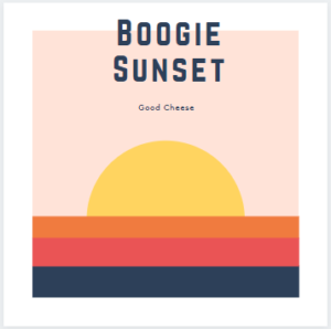
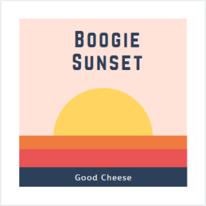
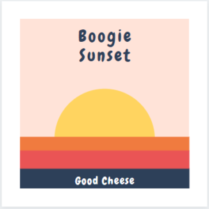
7. Last thing before our album is complete…let’s get rid of the white space by clicking and moving each piece of the template:
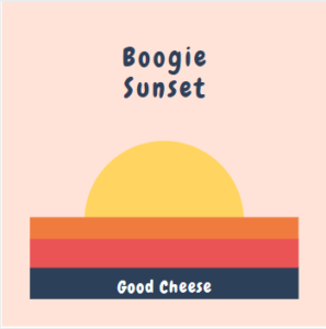
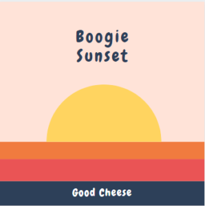
8. Everyone is familiar with step 8. We’re going to look at our album draft and ask ourselves, is it good enough?
We obsess over the font choice and the colors. It could always be better.
We regret our band name. Why did we pick Good Cheese?
9. Somehow we decide that yes, the album cover is good enough. And we love Good Cheese (and good cheese).
It took us 20 minutes and $0 to get our album cover done!
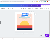
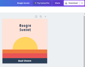
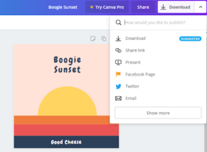
Our next step is to download the image so we can upload during our submission process. Click the download button in the upper right corner. And then choose either a PNG or JPG as the file type:
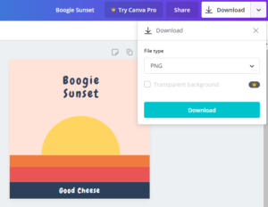
Our album is exported as a PNG file and ready for a submission.
Option 2 – You can use an image you already have and work within Canva to organize it.
Many album art covers show an image of the artist. If you have a smartphone, it’s likely you already have plenty of photos that could serve as an album cover. (Just make sure they’re high resolution and not blurry.)
Here’s a walkthrough of inserting an image into Canva:
- Go to Canva.
- Click “Create a design” and choose 3000×3000 as your custom dimensions.
- On the left-hand side, go to the Uploads section:
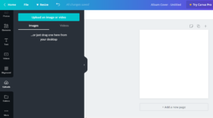
4. Click on “Upload an image or video” and choose your image.
5. Once it’s loaded, you can drag your image into the blank canvas:
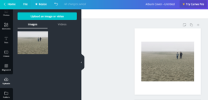
6. You may need to resize the image to fit the canvas:
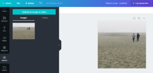
7. We can add text or other fun stuff to the graphic. The left-side menu will give you all sorts of options. But we decide to go with just the image.
8. We can download the resized image in Canva by clicking the download button in the top right corner. Make sure to choose a PNG or JPG as your file format:
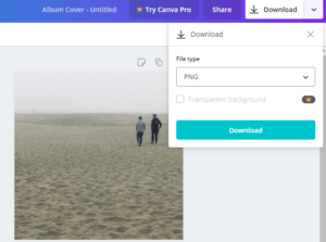
And that’s it! Once you download the image file you can upload it on the Art Uploader page.
As long as you’ve followed the artwork guidelines we outlined above the inspectors will approve the art, which ensures it passes the standards of the digital platforms and will not be pulled. Beyond that it’s down to your creativity and visual brand as to whether your cover artwork will grab someone’s attention enough for them to click play.
